Student-centric advice and objective recommendations
Higher education has never been more confusing or expensive. Our goal is to help you navigate the very big decisions related to higher ed with objective information and expert advice. Each piece of content on the site is original, based on extensive research, and reviewed by multiple editors, including a subject matter expert. This ensures that all of our content is up-to-date, useful, accurate, and thorough.
Our reviews and recommendations are based on extensive research, testing, and feedback. We may receive commission from links on our website, but that doesn’t affect our editors’ opinions. Our marketing partners don’t review, approve or endorse our editorial content. It’s accurate to the best of our knowledge when posted. You can find a complete list of our partners here.
What Are My Admissions Chances? Start with a Scattergram!
 By
Will Geiger
By
Will Geiger
Will Geiger is the co-founder of Scholarships360 and has a decade of experience in college admissions and financial aid. He is a former Senior Assistant Director of Admissions at Kenyon College where he personally reviewed 10,000 admissions applications and essays. Will also managed the Kenyon College merit scholarship program and served on the financial aid appeals committee. He has also worked as an Associate Director of College Counseling at a high school in New Haven, Connecticut. Will earned his master’s in education from the University of Pennsylvania and received his undergraduate degree in history from Wake Forest University.
Full BioLearn about our editorial policies

Bill Jack has over a decade of experience in college admissions and financial aid. Since 2008, he has worked at Colby College, Wesleyan University, University of Maine at Farmington, and Bates College.
Full BioLearn about our editorial policies

One of the most important questions in the admissions process is “what are my chances?” All students should be thinking about this well before they apply to college. In this post, I’ll explain to you how college counselors think about “admissions chances” and how you can use data to put together the best possible list.
Don’t miss: Scholarships360’s free scholarship search tool
Getting started
College counselors and admissions professionals almost never think about “admissions chances” in a super precise way. Trying to assess your percent likelihood of getting into a college is not useful.
Instead, college admissions professionals think about admissions chances in terms of broader buckets. These three buckets are:
- Reach
- Target
- Likely (or safety)
Reach schools are schools where your GPA and test scores are below average for accepted students. Reach schools can also be schools that are very competitive (think Ivy League schools and other highly selective institutions).
Target schools are schools where your GPA and test scores are about average for accepted students.
Safety schools are schools where your GPA and test scores are above average for accepted students.
These rough categories ensure that students will have good options and will not sell themselves short in the admissions process. A successful college admissions process will also probably mean that you are denied from some schools (which is okay!).
Apply to these scholarships due soon
More scholarships for HS seniors


So, how does a college counselor make those determinations?
The major drivers of that determination are test scores and GPA as these two factors are very correlated to whether a student is admitted or not. Other factors, including essays, activities, recommendations, and other x-factors (athletic recruiting, being from an underrepresented background, etc.), but for the sake of figuring out a target vs. a reach, the GPA/test scores are of primary importance.
Therefore, this also means that we can use objective data. For college counselors, the best tool to make these assessments are scattergrams.
Also read: When should I apply for college?
Scattergrams
Without a doubt, the best source would be your high school’s college planning software such as Naviance or Scoir. Using your high school’s specific software is important because it will use actual data from your high school (as opposed to more general, self-reported data from students all over the world).
If your high school does not have Scoir or Naviance, no worries! Cappex has a free scattergram tool that is also effective (though the data is self-reported from students all over the country).
See also: Finding a safety school
How can I use scattergrams?
Luckily, using a scattergram and analyzing the scattergram data is pretty easy. Let’s walk through the process of using scattergrams with an example.
Here is what a scattergram from Cappex looks like:
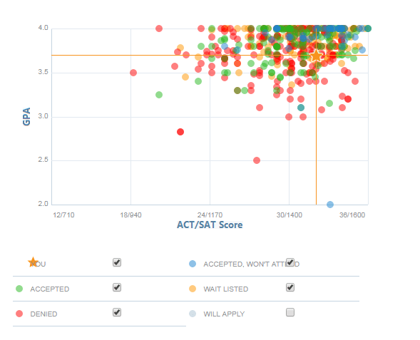
I created a fake student who is represented by the yellow star. On the horizontal axis, you will see test scores, and on the vertical axis, you will see the GPA. The other dots represent students who were admitted, wait listed, and denied, which gives us a quick visualization of the applicant pool.
We see that while there are some students being admitted with similar “stats” to our fake student, the majority of students have higher grades and/or testing. This means that this school would be a reach school.
Takeaways about the above scattergram
- Having higher “stats” than this person does not guarantee anything. We see that there are multiple students with very high GPAs and very high test scores who are either denied or wait listed.
- At the same time, we see students with “lower” stats who are admitted.
- These graphs do not contain any context about the rest of the student’s application or hooks
- We are not able to sort these graphs by “decision round” (whether a student applies Early Decision or Regular Decision). This is a college that offers Early Decision, so there would certainly be a difference in acceptance rates between ED and RD applicants.
Related: What are safety, reach, and match schools? and How to choose a college


 SAT" printed on his pencil">